FIRST POSTED: 27/03/14
A few years ago, in the La Central bookshop on C/Mallorca here in Barcelona, I saw a novel published simultaneously in both Spanish and Catalan and the fact that both versions were on sale at the same time and given prominent positions on the ‘new books’ table suggested to me that the author was either Spanish or Catalan and had recently published his/her book in both languages. The covers of the two versions were almost identical; in fact, the photo used on the covers was the same one, but reversed. The photo, if I remember it correctly (and I will return to La Central to see if I can locate it) was a train winding its way around a headland with a drop down to the river below. It looked to me like a Canadian location but it could be anywhere, I suppose. In one version the headland was on the left and the train was in danger of falling into the ravine on the right; on the other version the danger was falling into the ravine on the left and the train had difficulty sticking to the narrow rail line on the right. I have no idea which version is truer than the other, i.e. which photo really represented the topography, and really it is not that important, I guess, although maybe people from this area feel affronted by the false representation of the reality of the lie of the land, although the number of Spanish- or Catalan-language books reaching Canadian bookshops is probably not that high.
The interesting thing for me here is that the book designer (I can hardly imagine that two different people chose the same photo) felt that it was important to make two similar but mirror images for the covers of the two novels. Why? I guess that the designer got paid equally for the work and I suppose the photographer got paid at least once, and maybe twice, for the use of the photo.
When I returned to the bookshop recently I tried to find the book I mentioned above but it was impossible. I tried asking the staff for help but I had very little helpful information to give them. I did however find a few examples of novels with flipped cover illustrations of photos. These ‘flipped’ covers, all except the last in the list published by Anagrama, are Amélie Nothomb’s ‘Barba Azul’ / ‘Barbablava’; Christine Angot’s ‘Una setmana de vacances’ / ‘Una semana de vacaciones’; Jeffrey Eugenides’ ‘La trama matrimonial’ / ‘La trama nupcial’ and, a little differently, Jetta Carleton’s ‘Cuatro Hermanas’ / ‘Quatre germanes’. This last one has a cover which is not flipped but the moody sky in the background on the Spanish version is removed, leaving a white background. Curiously, the ‘sister’ on the left appears to stand straighter on the Catalan cover although the photo is the same.


A Belgian friend informs me, and I quote, that “in Belgium, the Dutch-language book market and the French-language book market are totally separated, meaning a publishing house would not publish both French-language and Dutch-language books. The publishers in Flanders publish Dutch-language books/translations and the ones in Wallonia publish French-language ones/translations. And therefore there would not be any similarity in book covers.” Anyone in Quebec, or any other bi-or multi-lingual country care to comment on the situation there?
A recent phenomenon in the European publishing world is the publication of the German novel by Timur Vermes called Er Ist Wieder Da [‘He’s Back’ / ‘Look who’s back’ in English], which in Spanish and Catalan is called Ha Vuelto and Ha Tornat, respectively. The book deals with the fictional return of Adolf Hitler to modern day Germany and the wonderfully clever cover design, by Johannes Wiebel of Munich’s ‘punchdesign’ studio, is achieved by the use of two motifs; the distinctive Hitler haircut, [sweeping from top-left of the cover to the right-hand side, across his forehead], and his trademark toothbrush moustache, both in black on an all-white background. The clever element here is that the book’s title, in sans serif capital letters, is compressed/expressed in the shape of the moustache. Anyone seeing this cover will immediately understand that the ‘he’ who has returned is Adolf Hitler although there is no mention of his name anywhere on the cover. That is the genius of the design, taking just two elements and creating a complete picture of what the novel is about.
This book has been translated into many languages and in most cases that I have seen (the Dutch version changes the hairline, for the worst) the cover design features the same haircut and moustache but obviously the words which form the moustache are different according to the language of the translation. I have no idea why the Dutch publisher decided to change the haircut, or if the designer was the same. It was initially very difficult to find the name of the designer of the cover – like translators, because they’re under-recognised and frequently not named – but I have to say that the design is brilliant.
Another interesting feature of the cover of ‘HA TORNAT’ is that in Catalan the auxiliary verb ‘have’, in the third person singular, is ‘HA’ which are, of course, Adolf Hitler’s initials, although ‘reversed’, which is another possible ‘translation’ of ‘tornat’. This linguistic piece of good luck works in Spanish too, although with the word ‘vuelto’ instead of ‘tornat’.

Another novel in which Hitler plays a prominent part is Don Di Lillo’s “Running Dog” and again the cover design, by Noma Bar, is wonderful. Just 4 elements are present here: two right-angled red triangles appear in the bottom corners of the cover, with the hypotenuse of each ‘forming’ the jawline; a small piece of film strip, complete with sprocket holes, represents/replaces the moustache, and finally there is a black trapezium at the top of the cover, the parallel sides of which are vertical and the long side of the figure slopes down from near the top left corner of the cover to a point just a little lower than halfway down the cover, representing the parting of the haircut. The book’s title and author also appear on the black background, in red and white type, respectively. These 4 elements ‘inform’ the potential buyer that the book will be about Hitler and that ‘film’ in some way plays a part in the plot too. In fact, the novel is about the possible existence of a pornographic film in which the male protagonist is Adolf Hitler, and all of this is conveyed in three colours and four shapes.

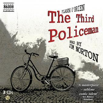
I have 14 books by Flann O’Brien on my bookshelf, with covers illustrated by various authors, but my favourite by far is the series of his books (The Poor Mouth; The Hard Life; The Best of Miles; Stories and Plays and The Dalkey Archive) published by Picador with covers by Ralph Steadman. Fourteen books by an author of only five novels –four in English, one in Gaelic– sounds a lot but some are in English and some in Spanish. No Catalan versions exist as far as I know and the earliest copies are worn out and back-broken through the extensive use I made of them while writing my dissertation, unfortunately before e-books were available to help students find the quotes they needed. For me, nothing compares to the Steadman versions although the text, in English is obviously the same. The two Spanish versions have extensive differences between them.
Thinking back to the Steadman/O’Brien covers reminds me of the bookshop where I bought my first books. It was fairly big, for our little town, and the large space at the back was filled entirely by books of the same colour: yes, an entire wall full of pale green Penguin Modern Classics. I spent so much time and money there and soon came to understand that practically any book in this series was worth reading. The colour scheme simultaneously gave a guarantee of quality and a feeling of comfort and trust, as if one was with an old friend. This sense of ‘brand loyalty’ also came into play when I started buying jazz records; practically anything on Blue Note was a safe buy, even if the name of the recording artist was a complete stranger. Blue Note’s album covers were also notable for the design by Reid Miles, frequently using the photographs of Francis Wolff, a German photographer turned record label executive. ECM later became an equally trustworthy friend in the the jazz field, much as I guess Stax/Atlantic were for soul music fans and Stiff Records was, briefly, for punks.

 These days, of course the CD format has all but destroyed the beauty of album art work and the digital download will soon see off the CD format. When one buys a digital download the effect of the cover art is barely noticeable on the small screen of the iphone or ipad, and frequently the album art simply isn’t there. On the book front, e-book readers and apps have changed the reading and buying habits and browsing now means something very different to what it meant when I got my first brown pay packet on Friday afternoons. Those days I spent Saturday mornings in the bookshop and the record shop: these days I do my browsing from the comfort of my chair. More convenient, but nowhere near as pleasurable, and I feel that the designers of LP covers (I’m thinking here about people who designed many Yes albums and the first King Crimson albums, Roger Dean and Barry Godber, respectively) may feel their art to be diminished aesthetically as well as physically.